- Home
- Technical Writing
- Four Frontier Models, One Prompt
Four Frontier Models, One 1,032-Line Prompt: What Each Built, and the Merge I Kept
By Jack Jin · July 21, 2026 · Updated October 4, 2026 · 9 min read · Includes my 14:15 video
Picking which AI model to pay for is hard, so I ran my own test. GPT 5.6, Kimi K3, Gemini 3.5 Flash and Claude Fable 5 each built my portfolio site from the same 1,032-line prompt, on top of about 5,000 lines of context about my work. I graded the four sites in a paper notebook, ranked them, then had AI merge the best of all four into one site.

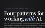
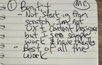
Most of the video is me going through each model's site, one at a time, with the pros and cons from my notebook. This page follows the same order, and each part links to its moment in the video.
I Made 4 Frontier Models Build My Portfolio Site With the Same 1,032-Line Prompt
Recorded July 21, 2026. Each part below links to its moment in the video, or watch it on YouTube.
1. One 1,032-line prompt built from four ingredients
I made it challenging on purpose. The prompt is 1,032 lines, and it is a merge of four things.
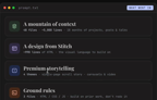
- A mountain of context. A library of 48 files, 4,817 lines of markdown, mined from every project, post and talk of the last 18 months. The library has its own catalogs and indexes, and the models read what they need. So this also tests whether a model can traverse a lot of context to do a thing.
- A common design from Google Stitch, about 990 lines of HTML, so all four sites start from the same visual language. In theory the result should look a lot better than my old blogs and videos page, which works but isn't what I'd call premium.
- Premium storytelling. I'm exploring different ways to present the material, and I called out Adobe here: I think their SLICC site looks very cool, the way it tells you a story as you scroll. My prompt asks for four themes, every project told inside one of them, as a single-page scroll story.
- Ground rules. Three files, HTML, CSS and JavaScript, and build on the prior work instead of redoing it.
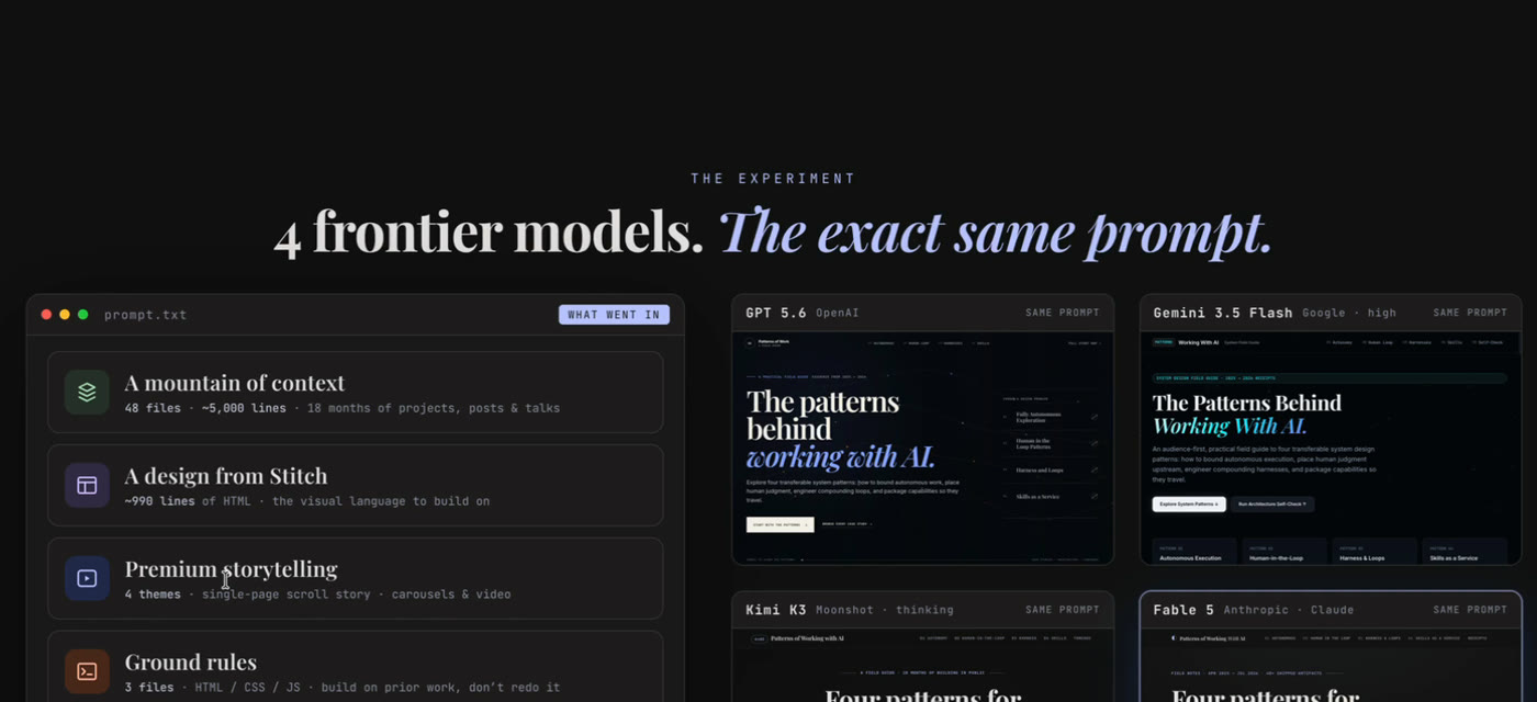
The page I opened the video with: four ingredients in, one 1,032-line prompt.txt, the same input four times.
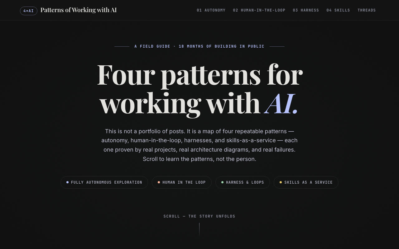
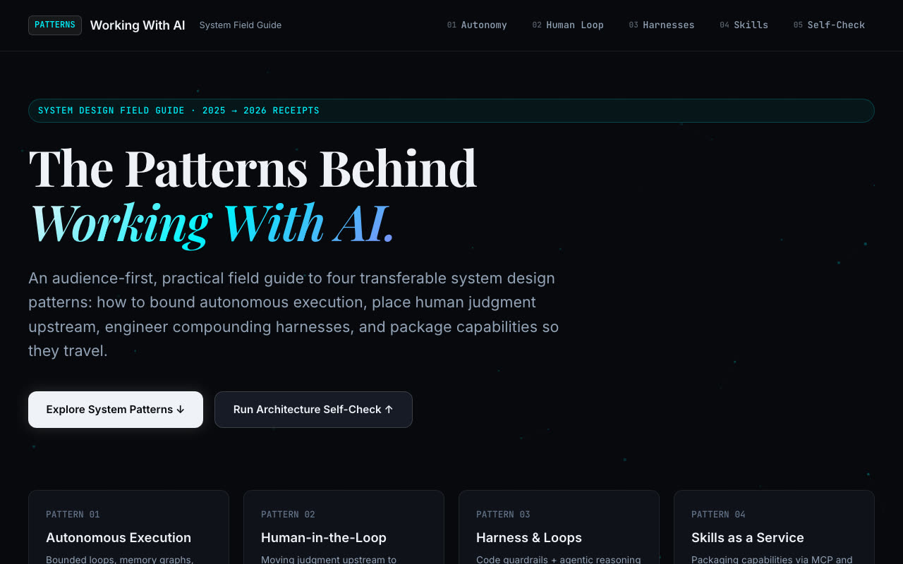
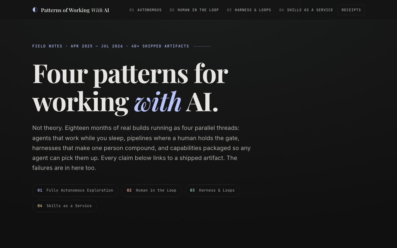
I judged each one on four things: how it interpreted the situation, how it handled that much context, whether it made things up, and how well it did premium storytelling on top of the design. Because they all got the same design and the same library, the four sites came back looking like siblings. The differences are in the details: animations, interactions, and what holds up and what breaks. The tabs below are the four home screens and the merged one, at the same size. Look for how alike they are; that is the shared design and library doing its job.
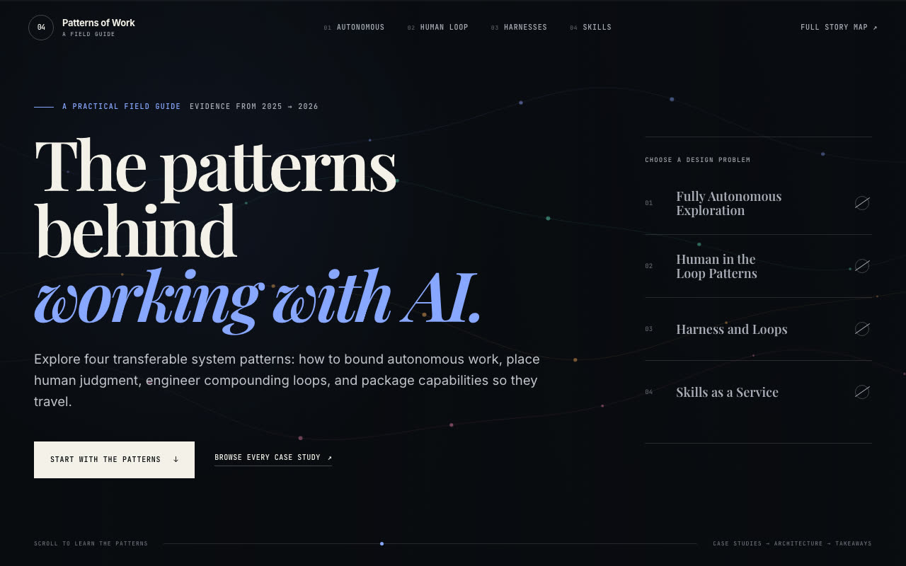
GPT 5.6: my favorite home screen
Kimi K3: less in front of the material
Gemini 3.5 Flash: the most basic of the four
Claude Fable 5: the most complete build
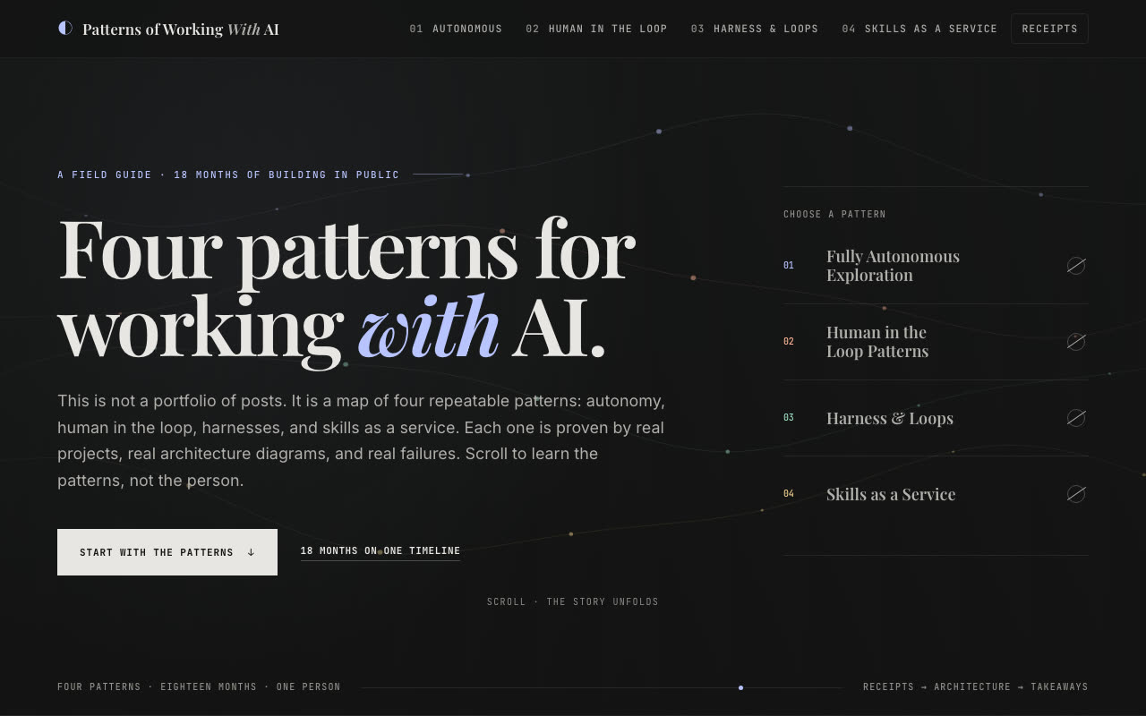
The merge: GPT's layout, Kimi's words
Watch this part 0:12 5,000 lines of context 0:43 A design from Stitch 1:23 Premium storytelling
2. GPT 5.6 had my favorite home screen, and a glaring hole
First up, GPT 5.6 Sol, which I ran in Codex. When I first land on this screen, it looks quite nice. It's one of my favorite home screens. I don't love the navigation, but I like the home screen a lot.
As I scroll, the site looks pretty and it functions, but the navigation bar doesn't light up as I scroll. There is a scroll bar at the very top, but it's hard to see. The aesthetics are clean, and it did a good job mirroring Stitch. The carousel with overlapping cards is nice, there's animation as I scroll, and the slider is accurate.
What I didn't like: clickable elements that don't do anything. And then one screen came up with content missing. For a premium model, I did not expect that screen to ever come up. Overall it's visually pleasing with visual flaws, and highly usable as a base. I would use it.
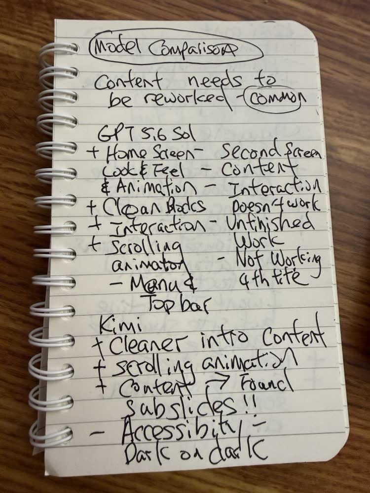
My notebook, page one. The note at the top applies to every model: the content needs to be reworked.
Watch this part 2:22 GPT 5.6 3:27 Clickable but does nothing
3. Kimi K3 dug deepest into the context, and made some up
Second, Kimi K3 in thinking mode, from Moonshot. It's one of the open-weight Chinese models competing with the top models right now. I've always liked Kimi's models because they're cheaper, and because I really like the slide decks it builds: pass in a few markdown files from a codebase and you get usable, editable slides full of accurate information that I'd be happy to take to a conference.
On the site, the first screen looks a little different. I still like GPT's more, but I like that there isn't a ton of information before you get to the material, and the navigation bar lights up as I scroll, which GPT's didn't. One part is very dark and hard to see; that may have come from the Stitch design, but I don't know how accessible it is. The carousel didn't have GPT's overlapping effect, but it works.
There are two animations I really liked. Agent work is tough to demonstrate, and one of them shows two things talking to each other. The other counts numbers up as you scroll down. Kimi also got the only double exclamation points in my notebook, for its subslides and its prompt animation. And it picked out the five parts of my talk. Kimi understood the 5,000 lines of context a little better than GPT did.
The part I didn't like: one piece completely missed the mark. It made up a bunch of stuff. In my notebook that's the minus next to the harness diagram. Overall, though, the navigation works better than GPT's, there's no glaring defect like GPT's missing content, and at the bottom it plotted my projects into categories on a timeline, which I don't think I asked for. I'm happy to see AI taking the premium storytelling to another level.
Watch this part 4:08 Kimi K3 5:14 The site 6:31 Five parts of my talk 7:01 Made up
4. Gemini 3.5 Flash was the most disappointing of the four
Third, Gemini 3.5 Flash, set to high. I won't spend long here. It was the most disappointing model of the four we tested. It looks basic, it isn't premium storytelling, and the scrolling animation is extremely lacking. My notebook has no notes for it at all. Sorry, Google, we're moving on.
Watch this part 7:50 Gemini 3.5 Flash
5. Claude Fable 5 looked the most premium, with too much animation
Last, Claude Fable 5. It opens with a timeline chart, similar to Kimi's, except Claude made it navigable: click a project and it takes you to that part of the page. That's storytelling over a timeline, very well executed. I don't like that the items wrap onto two lines.
Some of it is too flashy. A few elements are too bright, and when I'm trying to read, things flashing next to the text are distracting. It tried a little too hard with the animation. I want interactive, but the site should be readable. Still, overall it looks very premium, and Fable took in the design system from Stitch very well. The carousel is my favorite of the four because it saves space, where Kimi's version ran too long. It also found the outbound links, so every project points to the real post, and it had a typing animation and the best slider.
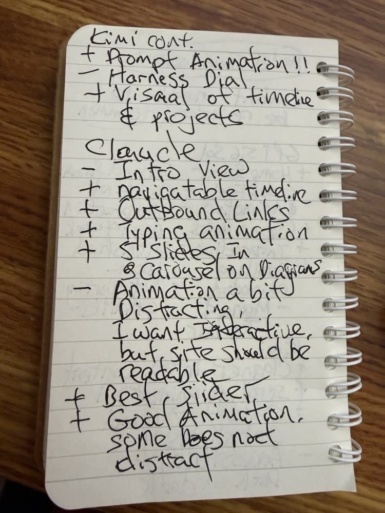
Page two: the rest of Kimi, and Claude. "I want interactive, but site should be readable" became a rule for the merge.
Comparing all four, I'd rank Fable number one, Kimi number two and Codex, GPT 5.6, number three, especially because GPT literally had missing content in its HTML. I know it's a one-shot, but we're comparing state-of-the-art models now.
Watch this part 8:14 Claude Fable 5 10:03 My ranking
6. Merging the best of all four, and what the merge really kept
Then I took all four and told AI to merge them. This is the important part, because there are clearly elements I like and don't like in each one. I took my paper notes, photographed them and uploaded them to Fable 5: pluses are good, minuses are bad. In case it couldn't read my scribbles, it asked me eight multiple-choice questions. Then it built a combined page from the elements I liked.
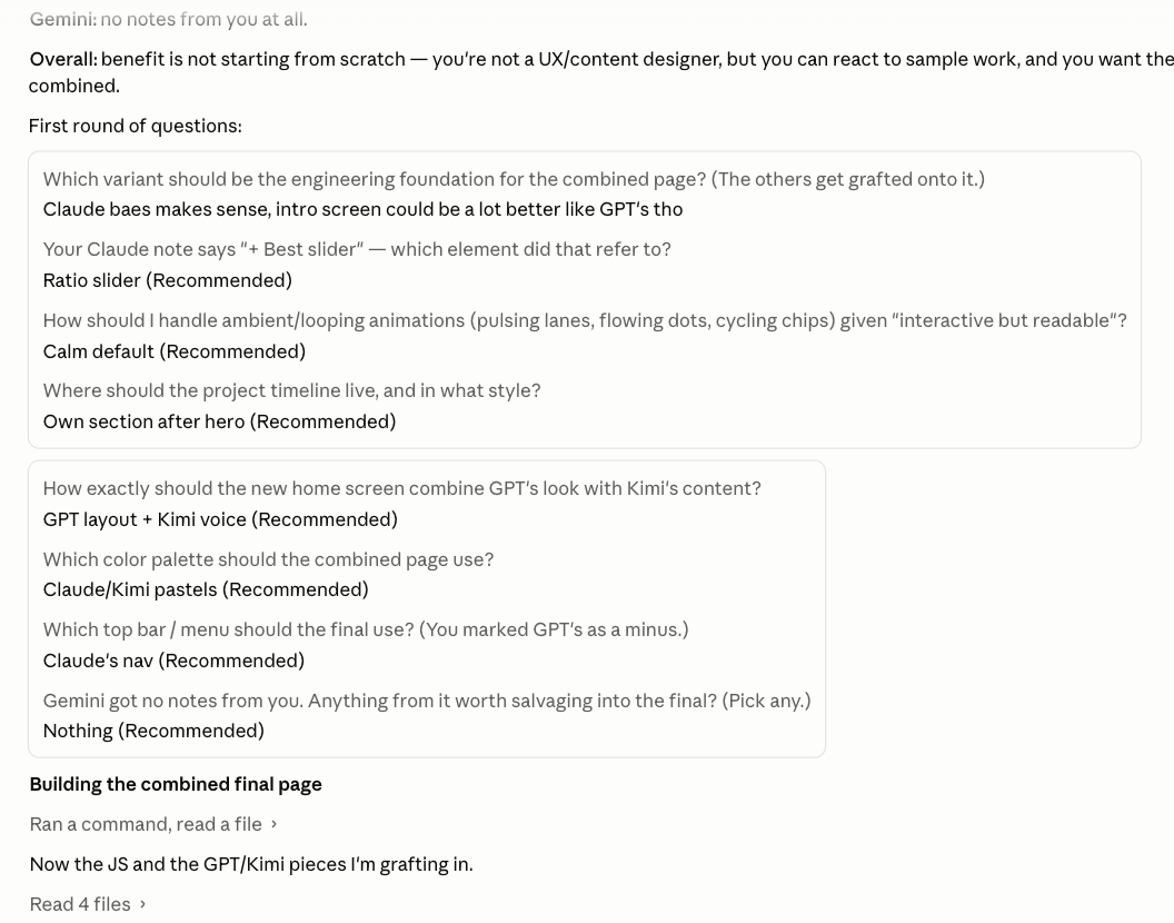
The eight questions it asked me, with my answers. The first one set Claude's build as the base the others were grafted onto.
So the final has GPT's home screen, Kimi's animation and scrolling, and Claude's navigation. I felt it took more of Kimi's HTML, which was a more faithful take on the original Stitch design. I also told AI to dim the animations once they stop, so they aren't overly aggressive, and it did a really good job of that. The numbers count up like in Kimi's and Claude's, and I took the carousel view.
Afterward I wanted to see what the merge actually kept, so I traced every line of the final files back to the four builds. Pick a model below. On the left is what I said I kept from it; on the right, how many lines of the final site appear only in that model's build. For Claude the two agree. For Kimi and GPT they don't, and the gap is the point of the next paragraph.
- The foundation the others were grafted onto
- The navigation and the navigable timeline
- The carousel view and the slider
- The numbers that count up, shared with Kimi
- The scrolling and the animation
- The numbers that count up as you scroll
- Its HTML, which I felt followed the Stitch design more faithfully
- The pastel palette, shared with Claude
- The home screen: its layout, look and feel
- Paired with Kimi's words. My answer to the merge question was "GPT layout, Kimi voice"
- Nothing. Asked whether anything was worth saving, I said no.
The trace says something I didn't say on camera. Line for line, the final is Claude's skeleton: more than half of every file appears only in Claude's build. What I picked from GPT and Kimi, the home screen layout and the scrolling, mostly came in as new code written to match them, which is why the merge added hundreds of lines no model wrote. A line count can't see a design choice, so both views are true. The skeleton is Claude's, and the feel is a mix of all three.
The one benefit I wrote down for myself: I'm not starting from scratch. I'm not a UX designer or a content designer, but seeing four versions of the same thing, I do have some taste. I can take what I like from all four and combine it into one, and for my taste the combined result is by far the best of the five.
Watch this part 10:29 Merging all four 11:00 Eight questions 11:36 The combined site
7. What I took away, and which model to pay for
Being able to run this test with all four frontier models, take what I liked from each and put it together into one final output is something you could do for many different tasks, not just storytelling in HTML. You don't have to pick one model up front. Make them compete, keep the best of each, and merge.
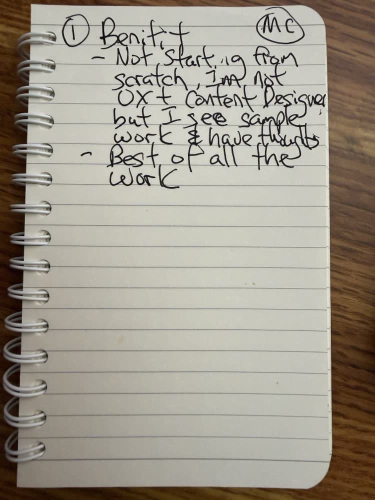
Page three, the takeaway, written before I recorded.
On the subscription question I opened with: I'm fortunate to have a paid subscription to each of these, at enough capacity to run tests like this without draining any one of them. All of them are good. ChatGPT's plans get you further for the money than Fable's. Fable is clearly the state-of-the-art model that everyone is competing against. And Kimi K3 is good, especially if you like its slide and deck building; I pay for Kimi so I can build decks and run some of my work in its cloud.
If you've run your own bake-off on a real project, I'd like to know whether you crowned a winner or merged like I did.
Watch this part 13:05 What I took away 13:18 Choosing a model